The Psychology of Color in Retail Spaces: Influencing Customer Behavior
 by michael daigle
Summary
Ever wonder why stores are decorated in certain colors? It’s not just for aesthetics. Retailers carefully select colors because they have a powerful psychological impact on customers and can directly influence behavior. Colors grab attention, spark emotions, and even encourage purchases.
Picture this: you walk into a store and the vibrant red walls immediately energize you. Your heart beats a little faster, you feel excited, and the space seems lively and upbeat. Without realizing it, you linger longer and buy more than planned. Those red walls weren’t chosen at random—they were intentionally used to create that energizing effect and keep you shopping. In retail, colors are never an accident; they’re a subtle but powerful tool to shape how you feel, act, and shop.
Introduction to the Psychology of Color in Retail
The colors in your retail space directly influence how customers feel and behave. By understanding the psychology of color, you can create an environment where people are drawn to browse, shop, and ultimately buy.
The Power of Warm Colors
Reds, oranges, and yellows are warm tones that spark energy and excitement. In retail, they can:
- Encourage impulse purchases by creating urgency.
- Make the shopping environment feel lively and vibrant.
- Increase heart rates and quicken decision-making.
The Calming Effect of Cool Colors
Blues, greens, and purples have a soothing, tranquil effect. They are especially effective for:
- Relaxing customers and slowing their shopping pace.
- Conveying quality, trustworthiness, and professionalism.
- Promoting customer satisfaction and loyalty.
Combining Colors for the Best Effect
A thoughtful mix of warm and cool colors maximizes contrast and visual appeal. For example:
- Red and green for a festive holiday shop.
- Blue and orange for a creative décor boutique.
- Yellow and purple for a playful children’s store.
By carefully selecting your color palette, you set the mood, influence how long customers stay, and guide their purchasing decisions. The investment you make in color strategy will pay off in both customer experience and sales.
The Meaning Behind Common Retail Colors
When you walk into a store, the colors around you are influencing your mood and shopping behavior—often without you noticing. Retailers choose color schemes with precision to evoke specific emotions and responses.
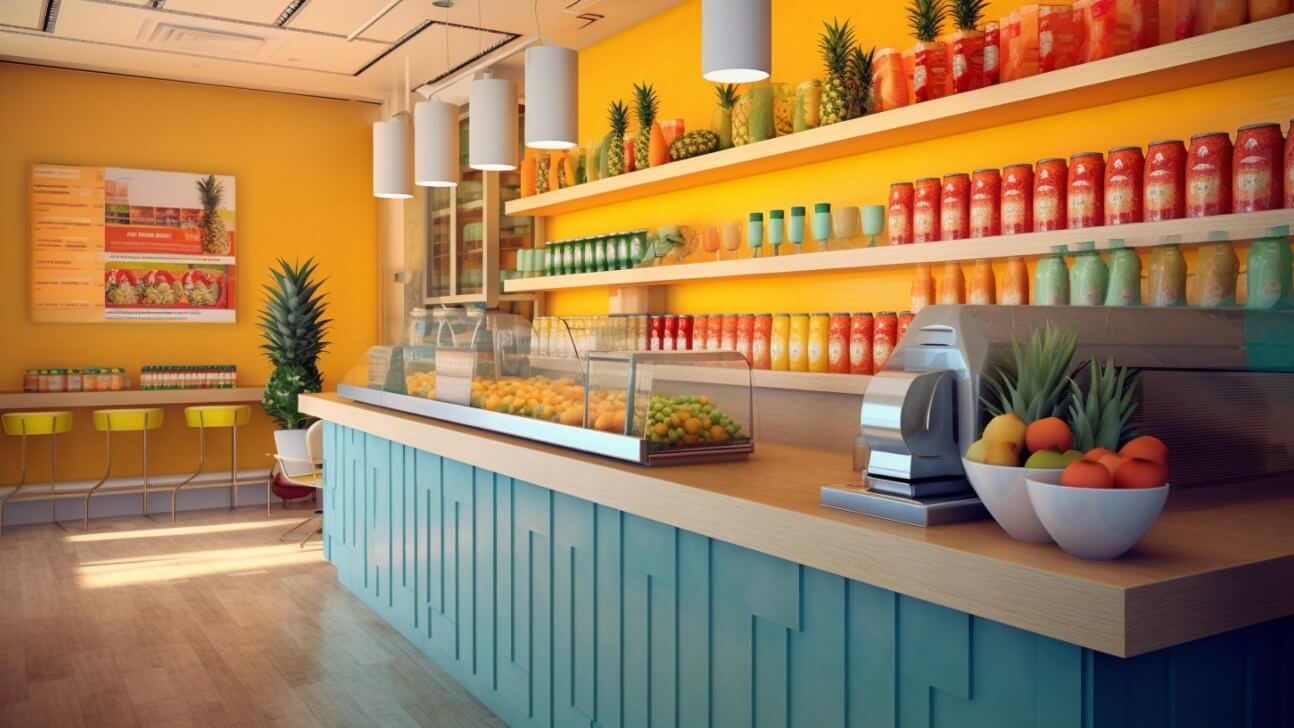
Red is bold and energetic, creating urgency and excitement. It’s often used to highlight sales or clearance items.
Blue is calming and trustworthy. Many brands use it in logos and décor to put customers at ease and inspire confidence.
Yellow is cheerful and optimistic. It brightens moods and encourages browsing, but should be used carefully as too much can feel overwhelming.
Green symbolizes growth, wealth, and renewal. Natural and eco-friendly retailers often use it to convey freshness and sustainability.
Orange is vibrant and uplifting. It stimulates appetite and mood, making it popular in food-related businesses.
None of these color choices are random. The next time you’re shopping, notice the colors around you—they reveal a lot about the retailer’s strategy and goals.
Using Color to Influence Customers’ Moods
The right color palette can significantly impact customer moods and buying behaviors. Choosing colors that align with your brand creates an environment where shoppers feel comfortable, inspired, and ready to purchase.
Red
Red energizes and excites, making it ideal for restaurants, bars, or nightclubs where you want to raise energy levels and encourage interaction. In retail, it draws attention to promotions and clearance racks but should be used sparingly to avoid overwhelming customers.
Blue
Blue builds calm and trust. Light blues create a welcoming feel for most retail spaces, while darker navy tones add a sense of authority and quality.
Green
Green is tied to health, nature, and renewal. Perfect for organic or eco-focused retailers, shades like teal or seafoam provide a modern, refreshing feel.
Yellow
Yellow radiates optimism and cheer. It brightens spaces and inspires creativity, though too much can be overstimulating. It works well for playful brands and children’s stores when used thoughtfully.
Neutral Colors
Neutrals—gray, beige, and brown—create balance and comfort. Light neutrals paired with wood tones feel warm and natural, while pops of bright accents prevent monotony. Neutrals appeal to the widest audience and provide a reliable foundation for any retail design.
Ultimately, your palette should align with your brand personality and create a shopping experience that feels good. With the right colors, browsers become buyers.
Warm vs. Cool Color Schemes in Retail Design
Warm colors like red, orange, and yellow evoke energy, enthusiasm, and positivity—perfect for grabbing attention and creating excitement. Cool colors like blue, green, and purple bring calm, trust, and security—ideal for making customers feel comfortable enough to browse. Balancing warm and cool tones creates contrast, interest, and a dynamic shopping environment.
Red
Red grabs attention and sparks quick action. In retail, it’s best used for promotions or sales highlights. Too much, however, can feel harsh, so pair it with cooler tones for balance.
Orange
Orange combines the energy of red with the friendliness of yellow. It feels lively and social, making it great for casual, playful, or food-related spaces. Too much can feel chaotic, so moderation is key.
Yellow
Yellow brightens and uplifts. It’s ideal for cheerful, budget-friendly, or youth-focused retail spaces. Pale yellows work well with neutrals for a more refined effect, while brighter yellows attract attention quickly.
Cool tones, on the other hand, create order and calm. Used alongside warm colors, they provide balance and sophistication. The right mix depends on your brand image and target audience, but together they can transform your space into one that inspires both comfort and action.
Choosing Accent Colors to Stand Out
Accent colors are a great way to make your retail brand memorable. Bright, intentional pops of color catch the eye, add visual interest, and keep customers engaged throughout their shopping experience.
Complementary Colors
Colors opposite each other on the color wheel—like blue and orange or red and green—are complementary. Using them together creates bold contrast that energizes a space. Accent walls, furnishings, or décor in complementary colors make strong visual statements that draw attention immediately.
Triadic Color Scheme
A triadic scheme uses three colors evenly spaced on the wheel, such as red, yellow, and blue. This combination provides balance and harmony. Try painting each wall a different triadic color for a cohesive look, or sprinkle triadic accents throughout the space for playful consistency.
Tetradic Color Scheme
A tetradic scheme combines four colors arranged in a square or rectangle on the wheel, like red, orange, green, and blue. Tetradic palettes are vibrant but can overwhelm if overused. Keep them to smaller accents—pillows, rugs, or artwork—or choose one primary and one secondary color for large areas, saving the others for subtle highlights.
Warm or Cool Accents
Accenting with warm (red, orange, yellow) or cool (blue, green, purple) tones creates a unified temperature scheme. Warm accents spark energy and excitement, while cool tones calm and soothe. Choose based on the atmosphere you want customers to feel when they enter your store.
Intentional accent colors help craft a memorable experience. Whether you stick to one scheme or mix approaches, update accents seasonally to keep your space fresh. Most importantly, choose colors that reflect your brand personality and the shopping experience you want to create.
Complementary Color Combos for Visual Interest
Complementary color pairs not only create visual appeal but also guide customer behavior. The right combination can highlight key areas, set the mood, and shape how shoppers move through a space.
Red and Green
Red excites and grabs attention, while green relaxes and reassures. Use red on accent walls or displays to draw customers in, and balance it with green seating areas or plants for a harmonious browsing atmosphere.
Blue and Orange
Blue conveys trust and stability, making it ideal for walls or branding. Orange adds bursts of energy, perfect for packaging or small furnishings. Together they create a lively, youthful look that encourages interaction and impulse buys.
Yellow and Purple
Yellow radiates cheer and optimism, while purple suggests luxury and sophistication. Use yellow around entrances for a welcoming feel and pair with deep purples on walls or furnishings for a boutique-style atmosphere ideal for high-end goods.
When applying complementary combos, balance is key. Select one dominant color for large areas and use its complement for accents and highlights. Too much contrast can feel overwhelming, but the right balance creates a bold, cohesive design.
Color Contrast Strategies to Guide the Eye
Color contrast is a subtle yet powerful way to guide customer attention. By introducing contrasts in your store design, you can:
- Highlight focal points: Use contrasting colors to draw attention to displays, signage, or promotions.
- Create visual paths: Lay out contrasting colors in sequence to lead customers through the space naturally.
- Set the mood: Warm contrasts (red/yellow) boost energy; cool contrasts (blue/green) foster calm.
- Showcase architecture: Highlight columns, archways, or staircases in bold contrasting colors to make them design features.
Examples of effective strategies include:
- Red displays or accent walls in a neutral-colored store for immediate impact.
- A “yellow brick road” pathway made from yellow signage, decals, or lighting to guide customers.
- Blue walls with orange accents for a dramatic, high-energy feel.
- Support columns painted in a bold contrasting color to become design focal points.
With the right contrasts, you can attract attention, guide movement, and create the mood that keeps shoppers engaged.
Developing a Cohesive Brand Color Palette
A cohesive color palette is essential for shaping customer perceptions and reinforcing your brand identity. To develop one:
- Define your brand personality and the emotions you want to evoke.
- Consider your target audience—teens and adults may respond to very different palettes.
- Account for cultural associations of color, especially in diverse markets.
- Pick a scheme (analogous, complementary, or triadic) to ensure harmony.
- Select a primary color to represent your brand, supported by accent tones.
- Test palettes through focus groups or surveys and adjust based on feedback.
- Use your primary color strategically in signage, displays, and walkways; apply accents for emphasis.
- Reevaluate over time to keep your palette fresh and effective.
A well-crafted color palette builds loyalty, strengthens recognition, and drives purchasing behavior. With regular evaluation, your brand colors will continue to support long-term success.
Final Thoughts
Next time you step into a store, take note of the colors around you. Notice how they make you feel and what draws your attention. Retailers use color psychology to influence your experience and purchasing decisions, often without you realizing it. Understanding their strategy helps you shop more mindfully—and gives you a deeper appreciation for the thought behind every retail space.