The Latest Trends in Exterior House Painting: Pop Those Colors!
 by michael daigle
Summary
Ready for a change? A fresh coat of exterior house paint is one of the easiest, most affordable ways to refresh your home’s look and boost curb appeal. Today’s trends celebrate boldness—gone are the days of dull beiges and lifeless whites. Homeowners are now embracing vibrant shades, unexpected combinations, and creative accents to make a statement. Whether you’re drawn to dramatic dark tones, playful pastels, or eye-catching patterns, the possibilities are endless. It’s time to grab your paintbrush, get creative, and let your home’s exterior reflect your unique personality.
Introduction to Exterior House Painting Trends
Bold, lively colors are taking center stage this season. If you want your home to stand out, consider adding a splash of vibrancy with your exterior paint choices.
Primary Colors
Red, blue, and yellow are making a stylish comeback. A cherry-red door or navy shutters can transform a neutral facade. For the daring, painting the entire siding in a primary color creates instant impact and major curb appeal.
Tropical Hues
Bright tropical tones like seafoam green, coral, and turquoise bring a playful, beach-inspired vibe. These shades add energy and a sense of escape to your home’s exterior.
Retro Revivals
Mid-century modern palettes are trending again, featuring olive, burnt orange, and teal. Pairing an olive-green base with teal or robin’s egg blue accents instantly evokes a nostalgic 1950s look.
Dark and Moody
Deep, saturated colors like eggplant, forest green, and charcoal add elegance and sophistication. Use them on doors, shutters, or accent walls and balance with lighter siding for a striking effect.
Combining Colors
Don’t shy away from mixing shades across your home’s exterior. Classic combos like yellow with blue shutters or a red door never go out of style, while bolder pairings—such as teal siding with coral accents and an olive roof—offer daring, modern flair.
When planning your color palette, consider your home’s architecture and landscape. Bright tones may overwhelm a small bungalow but look stunning on larger homes. Dark shades often blend beautifully with surrounding greenery. Trust your instincts—your home is your canvas.
The Comeback of Earth Tones and Neutrals
After years of bold exteriors, natural hues and soft neutrals are back in style. These grounded shades create a calming, timeless look that complements nearly any architecture.
The Comfort of Neutrals
Tans, browns, and grays blend beautifully into natural surroundings. They offer versatility, pair easily with accent colors, and provide a timeless curb appeal that won’t feel outdated in a few years.
The Warmth of Browns
From rich chocolate to lighter sand, brown shades bring warmth and versatility. Dark tones like espresso feel sophisticated, while lighter hues such as khaki or taupe give a relaxed, coastal vibe. Brown also pairs effortlessly with a wide range of roofing materials.
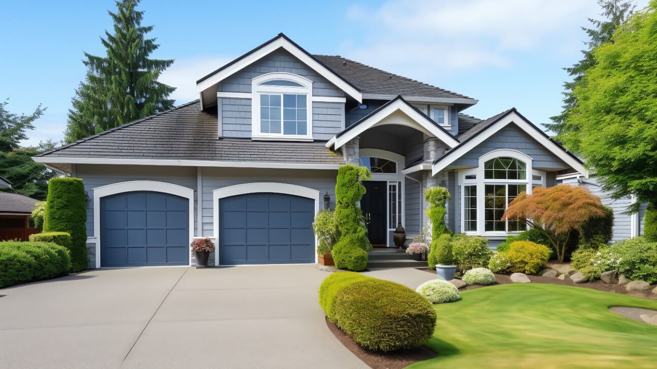
The Tranquility of Grays
Shades like charcoal, slate, and pewter are refined alternatives to beige. They’re adaptable to modern, craftsman, and traditional homes alike. Layer different grays for dimension or pair with crisp white or black details for contrast.
The Versatility of Tans
Camel, almond, and biscuit tans are neutral, nature-inspired shades that blend seamlessly with greenery. They’re easy to accent with navy, olive, or brick red, making them a safe and stylish choice for many homes.
Say Hello to Bolder Hues
Want to make a statement? Bold, saturated colors are trending for exteriors. These hues offer instant curb appeal and a sense of personality.
Rich reds, plums, and teals are favorites for doors, shutters, and accent walls. Adventurous homeowners can even coat the entire house in vibrant shades like cobalt blue or burnt orange for show-stopping appeal.
Blue continues to be a favorite, now seen in navy, teal, and bright azure. Paired with white or gray, it creates a crisp nautical feel. Combined with warm colors, it delivers a bold, modern edge.
Greens such as emerald and forest add lush depth, while electric lime offers an energetic pop. For warm lovers, crimson or brick red bring heat and sophistication, especially when paired with creamy neutrals.
Always check your home’s architectural style and neighborhood guidelines before going bold. A color that enhances your home’s design will give the best results—and earn plenty of compliments.
The Enduring Popularity of White and Gray
Despite shifting trends, white and gray remain timeless choices. Their neutral appeal highlights architectural details, landscaping, and decor.
Crisp White
White reflects light and makes spaces feel open and fresh. It also provides the perfect backdrop for colorful accents. Popular exterior whites include:
- Snowdrift: A bright, icy white with sharp contrast.
- Creamy: A soft, warm white that blends seamlessly.
- Ivory: A mellow shade with subtle warmth.
Charcoal and Slate Gray
Darker grays add drama and sophistication, while lighter ones offer airiness and charm. They’re also excellent at disguising material imperfections. Popular gray choices include:
- Charcoal: A deep, striking gray with bold presence.
- Slate: A medium-toned gray with blue undertones.
- Mist: A light, airy gray with subtle hints of blue.
To soften dark grays, pair with white trim or add natural touches like wood and stone. Colorful landscaping also prevents an overly moody effect.
Can’t decide between white and gray? Try limewashing or colorwashing. These techniques create depth with subtle variations, offering a balanced, textured look.
With their adaptability and elegance, white and gray are enduring choices that will keep your home stylish for years to come.
Choosing Colors That Complement Your Home's Architecture
When selecting exterior paint colors, think about how they highlight your home’s architectural style. Craftsman bungalows shine with earthy tones like sage green, rusty red, or chocolate brown. Victorian homes, on the other hand, look striking in deep jewel tones such as plum, navy, or forest green, which enhance ornate details beautifully.
A Bold Accent Wall
A bold accent wall instantly adds character. Try painting your front door a bright teal or sunflower yellow to make a cheerful statement. Alternatively, highlight a side wall or the space around windows with a complementary shade. Using colors opposite each other on the color wheel creates vibrant contrast and draws the eye.
White or Off-White for Trim
White or off-white trim gives windows, doors, and railings a crisp, polished finish. Subtle undertones ensure these shades blend with most palettes. For contrast, go darker—charcoal trim pairs beautifully with sage siding, while chocolate trim complements red brick for a bold, classic look.
Consider Natural and Manufactured Stone
Natural stone such as slate, limestone, or river rock enhances rustic appeal. Manufactured stone veneer offers a budget-friendly, authentic look. Blending grays, beiges, and browns creates harmony, or you can choose a shade that complements your siding. Stone also works beautifully alongside painted brick exteriors.
A New Roof for the Finishing Touch
Your roof is the crowning element of your exterior design. For cohesion, choose shingles within a similar tone family as your siding and trim. Weathered wood or slate-gray asphalt shingles work well across styles. Metal roofing offers sleek, modern appeal and comes in colors ranging from bright red to matte black.
With thoughtful planning, you can create an exterior color scheme that enhances architectural features while feeling stylish and complete. Balance and harmony between tones will give your home timeless curb appeal.
Mixing and Matching for Visual Interest
Mixing and matching colors adds personality and depth. You don’t need to stick to a single palette—playing with complementary, analogous, or contrasting shades makes your exterior stand out in memorable ways.
Complementary Colors
Colors opposite each other on the color wheel—like blue and orange or red and green—deliver bold contrast. Use one shade for siding and the other for trim, shutters, or accents to make both colors pop.
Analogous Colors
Shades next to each other on the color wheel, such as yellow, yellow-green, and green, create a harmonious look. Apply the lightest shade to siding, the medium to trim, and the darkest to shutters for a smooth, eye-pleasing progression.
Contrasting Shades
For dramatic effect, choose two contrasting shades of the same color family—like navy with baby blue or brick red with pale pink. Darker tones on siding with lighter accents highlight architectural details and add dimension.
Don’t hesitate to introduce extra accent shades in smaller touches—like shutters, the front door, or planter boxes. Pops of purple, orange, or teal add personality. Start simple with two base shades, then layer in accents until you achieve the look you love.
An eclectic scheme can make your home unforgettable. Experiment freely—paint is one of the easiest design elements to change if you want a fresh start!
Accent Trims in Contrasting Colors
Contrasting trims are an easy way to make your exterior stand out. Pairing complementary colors on trim, doors, or shutters creates instant curb appeal. Popular combinations include:
- Blue siding with orange or red trim: A lively mix of cool and warm tones that feels playful and bold.
- Green siding with yellow trim: Fresh, bright, and nature-inspired, especially with darker greens.
- Gray siding with navy or burgundy trim: Elegant and grounded, offering a touch of drama.
For a simpler approach, focus on your front door. A bright red or turquoise door turns it into a welcoming focal point. Limit accent colors to one or two to avoid visual clutter.
Keep architectural style in mind—what works for a Craftsman bungalow may not suit a Victorian mansion. Use color theory to build balance, whether with complementary, analogous, or triadic palettes. Apply accents thoughtfully to highlight features like doors, shutters, planter boxes, or trellises. For the biggest impact, pair an accent-colored door with coordinated outdoor accessories such as mats, plants, or lighting.
With careful choices, contrasting trims can elevate your exterior into something artful yet cohesive. Remember, restraint is key—a little color goes a long way!
Landscaping Tips for a Cohesive Look
Your landscaping should complement your exterior colors. Thoughtful plantings, pathways, and accents tie your yard and home together seamlessly.
Plant Flowers That Complement the House Colors
Select plants that echo your home’s hues. A blue house looks stunning with violet blossoms, while a red brick home pairs beautifully with pink or red flowers. Repeating colors across home and garden visually connects both spaces.
Add Accent Plants
Accent plants in contrasting shades create energy. Yellow or orange blooms pop against blue siding, while purple looks striking next to brick. Use sparingly for balance and cohesion.
Repeat Materials
Extend your home’s exterior materials into the yard. Walkways, patios, or retaining walls in brick, stone, or concrete provide consistency and create a natural flow between house and landscape.
Pay Attention to Hardscapes
Walkways and driveways guide the eye. Curved paths feel organic, while straight lines complement traditional homes. Choose shapes and materials that harmonize with your house’s style.
Include Outdoor Accents
Coordinate outdoor accents—planters, house numbers, mailboxes, and lighting—with your home’s palette. Keep these details simple so they enhance rather than overwhelm your design.
Aligning your landscaping with your home’s colors and materials ensures a polished, magazine-worthy finish. Stick to a unified palette and style for results that flow effortlessly.
FAQ on the Latest Trends in Exterior House Painting Styles and Color Schemes
Curious about the hottest exterior painting styles? Here’s what’s trending in curb appeal:
Bold, Bright Colors
Vibrant hues of blue, green, yellow, and red are making waves. Paint your door or shutters for a playful statement, or go bold and coat the entire exterior in a lively shade.
Two-Tone Color Schemes
Pairing two complementary shades creates stylish contrast. Light gray siding with navy trim is a popular choice, while forest green with burnt orange offers daring drama.
White and Light Neutrals
Timeless and airy, white or light beige exteriors never go out of style. Add depth with charcoal or black accents for a sophisticated twist.
Natural Wood Accents
Wood brings warmth to stone, brick, or stucco. Use it on doors, porches, or beams for rustic charm. Cedar and redwood offer durability with low maintenance.
Eclectic Mixes
Eclectic styles blend materials and colors in creative ways. Think wood shingles with whitewashed brick and a bold front door, or stone paired with board-and-batten siding. When balanced, eclectic exteriors exude charm and individuality.
Which trend speaks to you? With so many options, you can’t go wrong. Choose the style that reflects your personality and enjoy the boost to your home’s curb appeal.
Final Thoughts
Painting your home’s exterior is the perfect chance to showcase your creativity and elevate curb appeal. Whether you embrace bold palettes, stick with earthy tones, or mix styles for a playful twist, your home becomes a reflection of you. Don’t hold back—grab those brushes and bring your vision to life. The transformation will be well worth it!