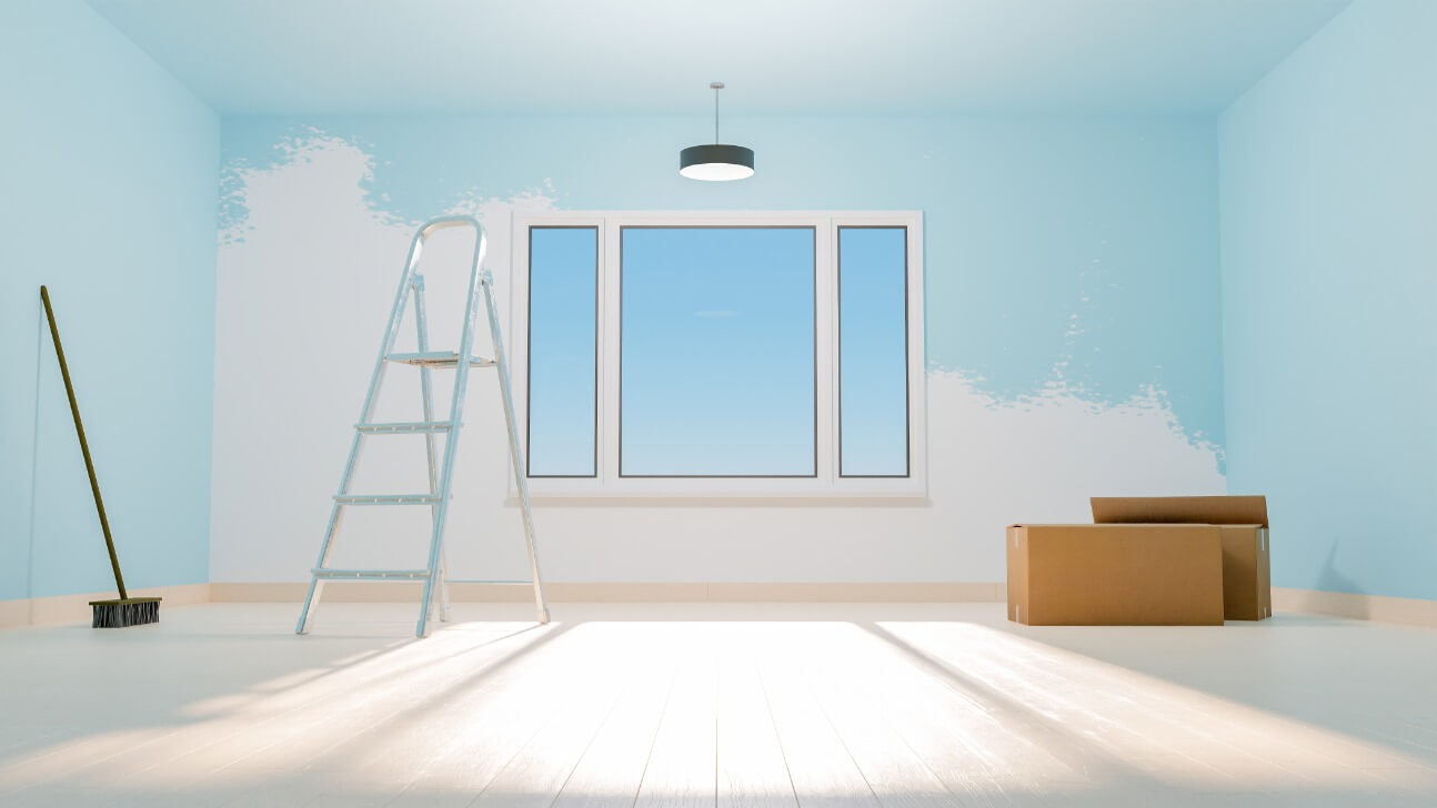
How Lighting Impacts Paint Color: Making Your Walls Look Their Best
 by michael daigle
Summary
Have you ever painted a room only to discover the color looks completely different than the swatch or sample you chose? The culprit is usually the lighting. Light dramatically affects how we perceive color—its source, brightness, temperature, and placement all play a role. Before you pick up a paintbrush, pause to consider how the lighting in each room might alter your chosen shade. The good news: with just a few adjustments, you can make sure the color you envisioned shines through beautifully. Let’s explore how natural and artificial light influence paint colors, and how you can use lighting to bring out the best in your walls.
Introduction: The Importance of Lighting When Selecting Paint Colors
Lighting is one of the most important factors in how paint colors appear. Different types of light interact with pigments in unique ways, which means a color may look entirely different depending on the lighting conditions in a space.
Natural light shifts throughout the day and across seasons. Morning light tends to be cooler, often making colors look more vibrant. Afternoon sunlight is warmer, enhancing earthy and golden tones. Even the direction of your windows matters—north-facing rooms get softer, cooler light, while south-facing rooms are flooded with stronger, warmer light.
Artificial Lighting
Artificial lighting also shapes how colors are perceived. LEDs and fluorescents usually cast a cooler, bluish glow that emphasizes greens and blues, while incandescent bulbs give off a warm, yellow tone that highlights reds and oranges.
Brightness makes a difference too. Softer, dimmer lighting can mute colors and create a cozy feel, while brighter bulbs intensify shades, making them look more vivid.
Layering Light
A layered lighting plan adds dimension and balance. Combining natural and artificial sources with varying brightness—ambient, task, and accent lighting—lets you highlight design features and set the mood. With thoughtful layering, your paint colors will look intentional and inviting.
The key is to evaluate how your room’s light interacts with potential paint choices. When lighting and color work together, you’ll achieve a polished, harmonious space where the walls always look their best.
Natural Light vs. Artificial Light: How They Impact Paint Colors Differently
Both natural and artificial light can dramatically alter the way a color appears on your walls. Sunlight streaming through windows and the glow from lamps or overhead fixtures each bring out different qualities in paint colors.
Natural Light
Sunlight is full spectrum, meaning it contains all visible colors of light. This makes paint look bright and true-to-tone during the day. However, the hue of sunlight shifts—warm yellow-orange tones dominate in the mornings and evenings, while midday light is cooler and bluer. As a result, your wall color can look different depending on the time of day and the amount of natural light in the room.
Artificial Light
Artificial lighting brings its own effects. LEDs and CFLs often emit cooler, bluish light that can make colors appear darker and more intense. Incandescent bulbs, on the other hand, provide a warm glow that emphasizes warm undertones. For the most accurate view, choose bulbs labeled “daylight” (5000–6500K), which mimic natural sunlight.
Placement and intensity matter too. Dim light softens colors, while bright light makes them pop. Overhead fixtures shine directly on walls, while table and floor lamps create softer, indirect illumination that bounces around the room.
By understanding how both natural and artificial light influence wall colors, you can create a lighting scheme that ensures your paint looks beautiful around the clock. With the right combination, your room will feel professionally designed day and night.
Warm Lighting Makes Some Paint Colors Appear More Vibrant
Warm lighting, such as that from incandescent bulbs, brings out the richness of certain colors. Its yellowish glow creates a cozy atmosphere while enhancing warm tones.
Reds and Oranges
Shades of red and orange thrive in warm lighting. Bold hues like tomato red or burnt orange radiate energy, while softer tones like terra cotta gain extra depth. The warm glow intensifies these shades, making them stand out beautifully.
Yellows
Warm light naturally enhances yellows. Bright lemon and daffodil shades appear cheerful and sunny, while golden tones glow warmly. Even pale yellows seem more expansive, reflecting light and opening up a space.
Browns
Brown tones feel richer under warm light. Deep chocolates and coffee shades take on a luxurious look, while lighter browns gain dimension. Warm lighting amplifies the comfort and coziness these colors already provide.
Avoiding Cool Colors
By contrast, cool shades—like blues, greens, and purples—tend to lose vibrancy in warm light, often looking dull or muted. If you love cool tones, pair them with cooler light sources like LEDs or fluorescents, or choose a slightly brighter shade than usual to balance the effect.
Overall, warm lighting paired with rich, warm hues creates an inviting, intimate space. By mixing warm and cool light—perhaps through accent lighting—you can strike the perfect balance and showcase every color at its best.
Cool Lighting Tones Down Bolder Paint Colors
Cool, bluish lighting has the opposite effect, muting bold or warm colors so they feel calmer and more subdued. Fluorescent and LED bulbs in particular can temper the intensity of reds, oranges, and other vibrant shades.
Blue and Green-Tinted Bulbs
Bulbs with a blue or green tint are especially effective at softening bold hues. They cast a cool glow that quiets warmer undertones, ideal for creating a colorful space without overwhelming the senses.
Fewer Lumens
Lower-lumen bulbs—like 60W equivalents instead of 100W—also make colors appear darker and less saturated. The reduced brightness mutes warm undertones, further softening bold walls.
Overhead vs. Task Lighting
The type of lighting you use makes a big difference. Overhead fixtures wash walls evenly with cool light, while task lighting such as floor or table lamps creates shadows and highlights. This variation adds depth and contrast to the paint color.
- Floor lamps with adjustable arms let you aim light toward furnishings instead of walls.
- Table lamps with conical shades direct light downward, reducing glare on walls.
- Uplights at floor level graze walls with angled light, highlighting texture without fully illuminating the surface.
By combining cool-tinted bulbs, lower-lumen overhead lighting, and carefully placed task lamps, you can fine-tune how bold colors are perceived. With a little experimentation, you’ll discover the perfect balance of vibrancy and subtlety to make your walls shine.
Bright Lighting Shows True Colors, Dim Lighting Changes Perception
Lighting dramatically shapes how we see paint colors. Bright lighting reveals shades in their truest form, while dimmer light softens and alters perception.
Bright Lighting
Under bright light—like daylight or strong overhead fixtures—you’ll see paint colors as they really are. Every undertone and detail is visible, making this the best way to judge a color’s accuracy before committing. The tradeoff is that some shades may look harsher or more intense than expected in full brightness.
Dim or Natural Lighting
In dim light, whether from lamps or indirect natural light, colors take on a softer, more muted quality. Undertones blend together, creating warmth and coziness. While this is perfect for intimate spaces, the same color may appear dramatically different when viewed in daylight or under bright overhead fixtures.
Task Lighting
Task lighting—like desk lamps or vanity lights—paired with dimmer ambient lighting gives you flexibility. Brighter illumination supports focus for tasks such as reading or applying makeup, while softer light fosters a relaxed atmosphere. This layered approach balances functionality with mood and helps showcase a paint color’s versatility in different situations.
Test the Lighting
The best way to know how a color will behave is to test it. Paint large swatches of your top choices on the wall and observe them over several days. Look at them in morning sunlight, under evening lamplight, and beneath bright fixtures. The shade that feels consistent and appealing across the widest range of conditions will likely be your best choice.
Ultimately, paint color is personal. Awareness of how light changes perception ensures you’ll choose a shade that makes your space feel comfortable, welcoming, and right for you—at any time of day.
Choosing Paint Colors Based on Main Light Sources in the Room
Your primary light source plays a huge role in how paint colors appear. Selecting shades that complement the lighting ensures your walls always look their best.
Natural Light
Rooms with ample natural light tend to make colors appear brighter and warmer. Muted shades often look more vivid, and earthy tones help connect the indoors with the outdoors. For accuracy, evaluate samples at the time of day your room gets the most sunlight, since the sun’s angle and strength shift dramatically.
Overhead Lighting
Overhead fixtures, such as pendants or recessed lighting, can make darker shades look richer and more dramatic, while lighter tones sometimes appear washed out. Medium-toned, saturated colors often strike the best balance here. Choosing warm bulbs (around 3000K) also softens the starkness of overhead light.
Table and Floor Lamps
Lamps provide diffused, softer light that flatters paint colors. This is a great opportunity to experiment with accent walls or jewel tones, which the lighting naturally tempers. Adding dimmers enhances control, allowing you to shift the mood and highlight your paint’s versatility.
Accent Lighting
Accent lighting, such as picture lights or spotlights, can make colors pop and add depth. Choosing slightly darker shades for walls under accent lighting helps balance brightness and highlight details. In smaller rooms, accent lighting can even create a sense of spaciousness.
By aligning your paint choices with your room’s main light sources, you’ll achieve a polished, intentional look that boosts both mood and functionality.
Testing Paint Sample Chips in Different Lighting Conditions
A paint chip that looks perfect in the store may look very different once it’s on your wall. Because light shifts throughout the day and varies by bulb type, testing samples in your actual space is essential.
Natural Light
Natural light often brightens and lightens colors, but the effect depends on direction and time of day. Northern light is cooler and softer, while southern exposure adds warmth. Check samples in the morning, afternoon, and evening—you might find that a shade that looks cheerful at noon feels overwhelming in strong afternoon light.
Artificial Light
Rooms that rely on artificial lighting tell a different story. Incandescent bulbs add warmth and yellow undertones, while LEDs and fluorescents can make colors cooler or more clinical. Always compare how your chosen shades appear under the actual fixtures you’ll use most often.
Mixing Light Sources
Many rooms use both natural and artificial light. In these cases, colors may shift throughout the day, even seeming to change “personality.” Testing samples under multiple lighting scenarios ensures you won’t be caught off guard.
The takeaway: live with sample chips on your wall for several days. View them in every condition your room experiences. This is the only way to guarantee a color that looks great around the clock.
Avoiding Surprises: View Paint Samples at All Times of Day
A color that feels perfect at night under lamplight might look entirely different in bright midday sun. To avoid disappointment, review your paint samples in all lighting scenarios your room will face.
Natural Light
Sunlight changes character from bright white at midday to golden and warm at sunset. Shades with warm undertones intensify in sunlight, while cool hues often appear crisper. Observe samples at different times to see how the day’s progression affects them.
Artificial Light
After dark, bulbs take over. Incandescents enhance warmer tones, while LEDs and fluorescents highlight cooler shades. Try this checklist:
- Turn on all fixtures—overhead, table, and floor lamps—to test full-room effects.
- Compare how colors look under direct overhead light versus softer lamp light.
- Experiment with dimmers: some shades feel dull at full brightness but rich and dramatic when dimmed.
Viewing samples under every condition ensures your chosen color looks consistently appealing—whether at sunrise, midday, or under lamplight.
Final Thoughts
Lighting is just as important as the paint itself in shaping a room’s atmosphere. By paying attention to how natural and artificial light interact with color, you can make choices that enhance both mood and design. Don’t be afraid to experiment with dimmers, layered lighting, or sample chips before committing. With a little planning, your paint colors will look their best in every light, transforming your space into a place you’ll truly love.